
Accessibility Quick-Reference

This page presents some basic accessibility guidelines for IPM faculty and staff. The first part of the page contains a quick-reference guide for common accessibility features. Below are specific sections for PDFs, school web pages, and other digital documents.
Due to the ever-evolving nature of the internet, accessibility guidelines are continually improved upon. This page is intended as a general outline, not a comprehensive guide. Those looking for the most up-to-date information can start with the Web Content Accessibility Guidelines (WCAG) Overview. The World Wide Web Consortium also provides a WCAG quick-reference.
Contents
Explore the different accessibility features found in our digital documents and learn the most inclusive methods of sharing data. Select a title to expand the page and reveal details about each topic.
File properties are often overlooked because they're only displayed in metadata, but they are an important part of locating a document. Fill-in the title, author, keywords, and summary of every file. Fortunately, the process of updating file metadata is quick-and-simple.
In most software, file properties can be accessed by clicking "File" in the top menu bar, then selecting "Properties" from the drop-down list. In the CMS, page properties (or parameters) can be accessed from the "Page Edit" menu.
Keywords
Relevant terms that are not mentioned in a document's title or summary can be added to keywords. Keywords may include scientific names, author, and department.
In each document, the fields for title, author, and summary should be populated. If the terms in those fields don't hit key descriptors (e.g. scientific names), keywords present the opportunity. Each keyword should be separated by a comma or semicolon. Keyword capitalization generally does not matter, but as with file names, avoid using the following characters: ! = ? @ % ^ *; ~ `, (){} <> |
Keywords on a document about noxious weeds might include "noxious weeds; invasive plants; ipm; celastrus orbiculatus; msu extension;" along with other words that identify the subject and author. 5 to 10 keywords are adegquate for most documents, but more can be used.
Learn more about keyword and file properties on the Understanding Metadata page of the Web Accessibility Initiative's Understanding WCAG 2.0 guide.
This section contains pointers for internet and archive friendly file names; note that we're not talking about the document title, but instead, the actual file name that is seen in a file's URL or folder. The term filename is just a contraction of the words file name, both terms have the same meaning and are interchangable.
Mirror the Document Title
Due to the other constraints mentioned in this section, it's not always possible to simply copy a document's title to its file name, but try to stay close to the original title. The title can be summarized, but it shouldn't be completely different. When many related files will be stored together, or are part of a series, consider adding a prefix or suffix to the title (details below).
Use Only Letters, Numbers, Hyphens, and Underscores
These characters are safe for use on the internet, because they can be displayed in all languages, and are generally not needed for special functions. Continue reading for information on which to use, and when.
Always avoid using reserved characters in file names, such as: ! = ? @ % ^ *; ~ `, []{} <> |
No_Spaces
Every netizen has seen nonsensical web addresses that are full of percentage signs, the reason for this due to a mechanism called percent-encoding, or URL encoding. Spaces in a web file name are encoded as "%20", commas are encoded as "%2C", along with a number of other reserved characters. This is why it's best to stick to basic characters, as mentioned above.
Us humans have an easier time of making sense of a statement when the words are separated, therefore, underscores and dashes have become the standard replacement for spaces in file names. The reasons to choose one or the other are complicated, but the skinny is that files with dashes are indexed by search engines, while those with underscores are not. We want web pages to be indexed, but we don't want to index non-web content, like PDFs.
- underscores_for_pdf, and anything not listed below (Word, Excel, PowerPoint, etc.).
- Example: ipm_survey_results.pdf
- dashes-for-web-page, also folders, audio, video, and images.
- Example: ipm-survey-results.html
no capitalization
Modern computer systems don't have much of a problem with capital letters, but they do have the potential to break links for some users. Best practice is to outright avoid using capitalization in file names.
Date Formatting

This xkcd comic summarizes the need for ISO 8601. If dashes are used, beware of long file names.
Since 1988, the international standard for time and date formatting is to write in big-to-small increments (ISO 8601). Not only does this allow for universal clarity, but it also assists in organizing large batches of files, because they can be easily grouped in chronological order based on name alone.
Though it's not a rule, consider omitting dashes between the numbers, because dashes are meant as a substitute for spaces. If dashes are used in a date, be aware of the overall file name becoming too long. A string of numbers may look odd at first, but you'll quickly become accustomed to reading dates this way; you'll also start spotting dates in other places, like product serial numbers.
Examples of ISO 8601 Formatting
- yyyymm
- May 1996 becomes 199605 (1996-05)
- yyyymmdd
- May 18, 1996 becomes 19960518 (1996-05-18)
- yyyymmddhhmmss
- May 18, 1996, at 7-seconds past 3:36PM becomes 19960518153607 (1996-05-18 15:36:07)
Considerations for File Organization
When we're dealing with a giant batch of files or folders, it's best to have a way to organize them, and sometimes just using their titles doesn't cut the mustard. The simplest solution is to add a number to the front of each filename. A date holds more information, and is universally understood (by ISO 8601 nerds), but isn't always the best solution. Be creative, but try to make the naming scheme useful to others. Below are some basic considerations for naming groups of digital files and folders.
- Numbered files or folders to keep track of order:
- 01_my_file_name.pdf
- 02_my_file_name.pdf
- 03_my_file_name.pdf
- Date in front of the name for chronological listing:
- 199605_my_file_name.pdf
- 199607_my_file_name.pdf
- 199702_my_file_name.pdf
- Date behind the name for alphabetical listing:
- my_file_name_19961103.pdf
- their_file_name_19970314.pdf
- your_file_name_19960525.pdf
- Time (24-hour clock) and date can be used to keep track of file versions:
- my_file_name_199603171350.pdf
- my_file_name_199603171432.pdf
- my_file_name_199603171435.pdf
If the above examples were online content, like web pages and images, dashes should be used instead of underscores. Also note the lack of capitalization. Details above.
Fonts, or typefaces, also have accessibility requirements. If a font is too small, it may be difficult to read; if a font has too many curves (serifs), it can be difficult to distinguish between letters. Color contrasts need to be strong enough that fonts standout from their background. There are also guidelines for the use of italics, bold, and underlines. Please read on for details about each attribute.
More information can be found on the WebAIM fonts page.
Serif
A serif is a decorative line, or taper, added to the beginning and/or end of a letter’s stem, which creates small horizontal and vertical planes within a word. Times New Roman is a common serif font.
As mentioned at the top of this section, serif fonts should be avoided because their extra strokes can make it difficult for people to distinguish between letters. Choose a sans-serif font instead.
Sans-Serif
As the name implies, this font family lacks serifs, or extra strokes. Sans-serif fonts are easy to read and are therefore the best option for accessibility.
Popular sans-serif fonts include Arial and Helvetica. The MSU Branding Guide suggests using ITC Franklin Gothic for publications.
Font Size
There's no way of knowing exactly how a font will look on every screen, so font size also needs to be taken into consideration. There's no perfect font size for every situation, but it's best to avoid any font that is labeled as small, or that is below 9 point.
- 12 point font is generally considered normal size.
- 18 point (or 14 point bold) font is considered large.
Underlining
Do not underline numbers and text. Underlined characters can be difficult to read, because the bottom of fonts are often cropped by the underline. Secondly, links (or shortcuts) are automatically underlined by most web browsers; it's something that readers are accustomed to, and adding extra underlines leads to confusion. Note that the WYSIWYG toolbar, in the CMS, doesn't even have an option for underlining.
Italics
Similar to serifs, italicizing fonts can lead to reader confusion. The use of italics should be limited to short phrases, such as scientific names. Avoid using italics on links, because they are often underlined by web browsers, and the combination can weigh heavily on readability.
For more information, see the W3C page for Understanding Guideline 3.1.
Bold
Similar to italics, bold fonts can lead to reader confusion, and their use should be limited to short phrases. Because assistive technologies often don't distinguish bolded font, do not rely bold alone to convey information. Don't avoid using bold entirely; italics are ok, color is ok, and bold is ok, just keep in mind that not everyone will notice these attributes, and there are some basic guidelines for their use.
Font Color
Never rely on color alone to convey information.
Text-to-background color contrast needs to have a ratio of 7:1. Large text (14 point or greater) can have a ratio of 4.5:1. The WebAIM Contrast Checker can be helpful in determining text-to-background ratios.
Link text should have a contrast ratio of at least 3:1 with the surrounding text. Use the WebAIM Link Contrast Checker to help determine link-to-text color ratios.
Lastly, we're all familiar with blue text links; best-practice is to avoid using blue for non-links, because mixing them together can confuse your readers. Note that using blue on printed media is a good way to distinguish links.
For more information, see Use of Color, Understanding SC 1.4.1.
Ampersand (&)
Some assistive technologies announce ampersand as "ampersand". This is rarely the author's desired effect, so ampersand is best avoided all-together.
Ampersand is also a reserved character and is therefore translated to "%26" when encoded as a URL. If a filename is "Insects & Plants.pdf" the link would be encoded as "Insects%20%26%20Plants.pdf", which isn't readable. Naming the file "insects_and_plants.pdf" solves the readability problem by not using any reserved characters, like spaces and ampersand.
Capitalization
Headings and Titles
The WCAG calls for headline-style title and heading capitalization, so that titles are distinct from other written content. Scientific journals are rebels, don't let their bad-boy style influence your writing elsewhere.
ENTIRE WORDS
Do not capitalize entire words unless they're trade names, acronyms, or abbreviations. The reason for this is because some assistive devices read capitalized words letter-by-letter, which can get confusing when dealing with an entire sentence or paragraph. Capitalized words are also simply more difficult to read, because there is not much difference in the shape of each letter; they're all essentially square. Besides the above, most people on the internet consider it yelling, and you wouldn't want that, WOULD YOU?
These are general guidelines for the use of headings and nesting. There are intricacies that vary between document type, but these three rules always stand:
- If the font on a heading is too big or small, adjust the heading style, not the heading number.
- Images should not be used as headings.
- Use headline-style capitalization for headings.
The first heading on a page needs to always be Heading 1, which is usually the document title. Everything related to the title should be "nested" beneath Heading 1. Heading 2 is typically going to be where you start breaking up the primary sections of the content. Nested below Heading 2 would be sub-content headings, then sub-sub-content, and so-on.
Not only does proper page structure assist readers with navigating documents, it also helps authors address the flow of the information they're presenting. It's a win-win situation.
More information can be found in the W3C Page Structure Tutorial.
Heading Example
The two lists below are matching examples of how headings can be used on a basic document. The second list shows the headings that should be used in the first list. The indentations are purely for illustration.
- Document Title
- Table of Contents
- Part 1 Title
- Part 1 Sub-title
- Part 1 Sub-sub-title
- Part 1 Sub-title
- Part 2 Title
- Part 3 Title
- Index / Appendix / Footer
- Heading 1
- Heading 2
- Heading 2
- Heading 3
- Heading 4
- Heading 3
- Heading 3
- Heading 2
- Heading 2
- Heading 2
This example page contains the above heading structure in the CMS.
Why is Nesting Important?
Assistive technologies, such as screen readers, need to know what order to read content in. Also, search engines use headings to index the structure and content of web pages. Lastly, it puts a proud little tear in the eye of your 5th grade English teacher.

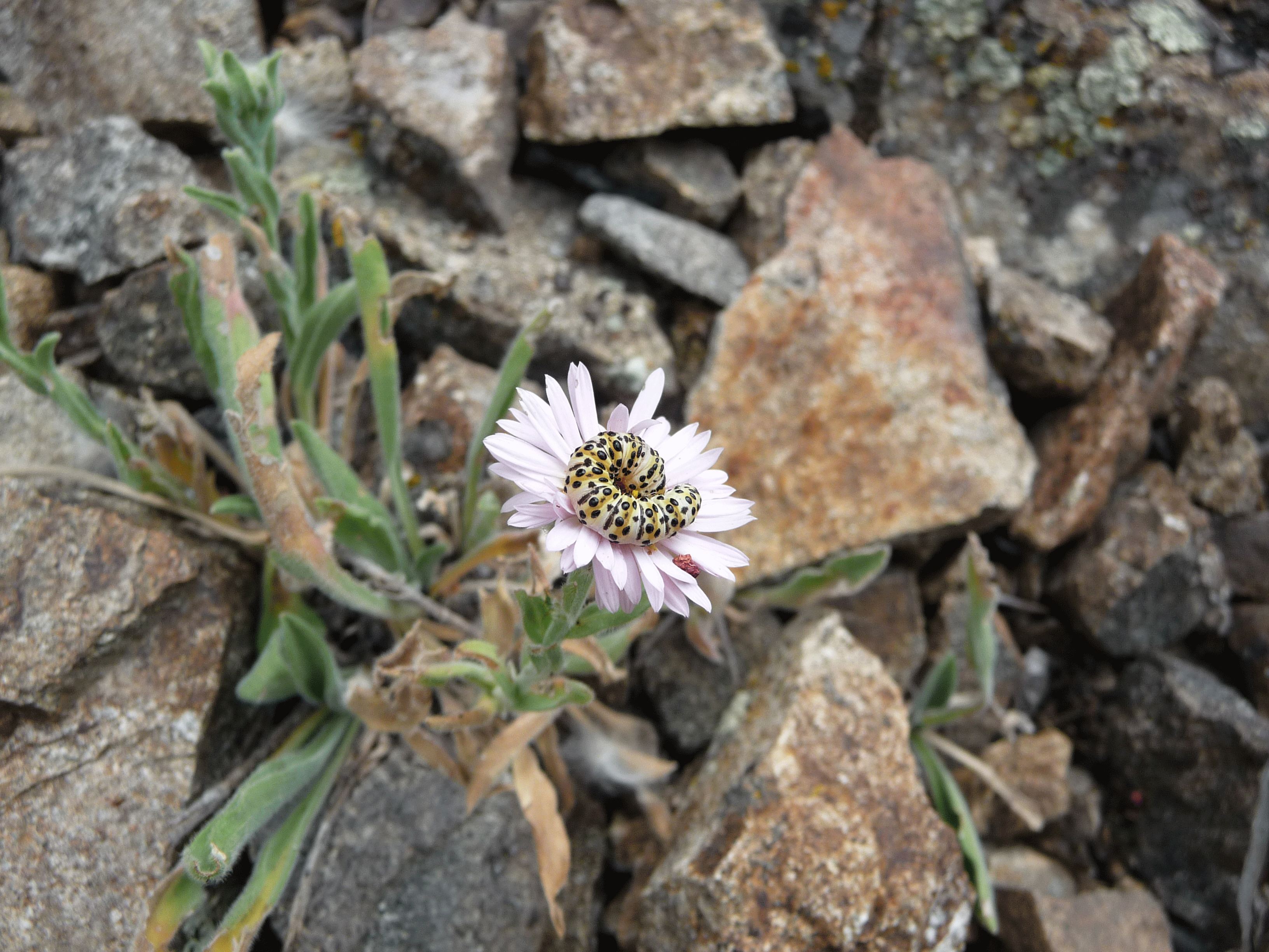
Owlet moth caterpillar (Cucullia speyeri) snacking on a Bighorn fleabane daisy (Erigeron allocotus). Bridger Mountains. Photo by Brett Gosselin. Larger image (5.2MB).
Photos, graphs, and branding are important aspects of a document. Care needs to be taken to ensure images are accessible to individuals with disabilities, as well as those who may be viewing the document on devices with small screens, such as mobile phones. Overall size should be considered when adding images to a web page; images affect page load time, which is not only frustrating for users, but slow page loads also lower search engine ranking.
Alt-Text
Add an alternate text (alt-text) description to every image, without exception. Aside from making images accessible, alt-text also adds search engine optimization (SEO) value to web pages.
- Briefly describe the image in one or two sentences; be concise, but aim for less than 100 characters.
- Do not copy the image caption; alt-text should provide new information that can only be found in the image itself (objects, colors, setting).
- For more information on image alt-text see Understanding Guideline 1.1 and the W3C Images Concepts tutorial.
Complex images
Images that contain substantial information require not only alt-text, but also a detailed description. If an image can not be described in fewer than 100 characters, it is a complex image. The alt-text character limit is partially meant to encourage authors to better describe images in the main article or image caption. When adding a robust description (in the article or caption) isn't an option, the image will require further accessibility features that involve editing HTML code in the CMS. See the W3C Complex Images page for more information about adding long descriptions; WCAG 2.0 Success Criteria for long descriptions can be found at the bottom of the page.
Web Optimization
In terms of page load time, images are typically the largest part of the equation, and therefore have the most impact on performance. Remember that the internet isn't fast-and-cheap for everyone; embedded images should be optimized and compressed.
Most image editing software has an optimize or "Save for Web" function, use it for every image you post online. Social media apps and websites automatically optimize the images you upload, and the same goes for mobile phone carriers, but the CMS does not. If you are sent an image over the phone, or have posted it on social media, image optimization may have already been performed, and you can just copy the image from there to the CMS. If the image is of lower size and quality than the original, it has been optimized.
- Use image editing software to properly size images (dimensions and file size).
- Do not fill a single page with dozens of images.
If a large image is required, link to it instead of adding it to the main page body. A popular method for this is to create a small version of the image and then add a link to the full-size image in its caption (example).
The MSU Web & Digital Help Center provides a detailed guide to Preparing Images for the Web. More information on image optimization from the Google developer forum. A detailed guide for exporting web-friendly images from Adobe Photoshop is in the works, and will be posted here soon.
Metadata
Be aware of image metadata. If you've taken photos in your top-secret camping spot, make sure your phone hasn't geo-tagged them with GPS coordinates. Though it isn't required, image metadata should include the author, a summary or description, and terms of use.
Images with Text
Do not overlay text on images, or use images of text, because the text needs to be readable to assistive technologies. We're striving for WCAG 2.0 level AAA, which does not allow for images of text. In situations where it's unavoidable, be sure to include descriptive alt-text for the images. For those who are comfortable editing HTML and CSS, an accessible alternative is to overlay text on images.
Image Editing Software
- GIMP (GNU Image Manipulation Program) is a free and open source, cross-platform, image editor available for GNU/Linux, OS X, Windows, and other operating systems.
- Inkscape is a free and open source vector graphics editor for GNU/Linux, Windows, and MacOS X.
- Pixlr is a free online photo editor that runs in a web browser.
- Canva is another online photo editor.
- Adobe Photoshop is available to MSU faculty and staff, on campus computers.
Creating accessible tables can be a complex operation that requires editing of code and the utilization of software features that aren't normally used. Tables should only contain data, do not use tables for web page layouts. Tables require markup that defines header cells, data cells, and their relationship to one-another. Even when a cell is left blank, it needs noted in markup.
Each document type handles tables differently, below are links to table making tutorials for a few common applications. Regardless of the software that's used to author a table, considerations should include:
- Lists can often be used in place of tables.
- Table rows and columns need to have headings.
- Tables require a summary (explain how the table functions).
Software Platforms
Below is a list of common applications that are used to create tables. If your preferred software is missing, please contact an Extension IPM specialist to have it added.
- Information on HTML (CMS) tables can be found on the W3C Table Concepts page.
- PDF tables have accessibility requirements, and should be examined with Adobe Acrobat.
- Microsoft Office allows the creation of accessible tables in Excel and Word.
- LibreOffice also provides accessibility features.
CMS is an abbreviation for Content Management System, which applies to software platforms that are designed to manage digital content. MSU uses a CMS called Omni Update Campus, OmniUpdate, or simply OU Campus. Having a U in the abbrieviated name of software that is designed for universities is an interesting choice, just remember that it's not referring to Oregon, Ohio, Oklahoma, Orlando, or any other university; it simply means update. Assistance with the operation of OU Campus is available via the MSU Web and Digital Help Center's Content Management Systems page.
The web pages we create in the CMS need to be accessible. The CMS will alert to some accessibility errors, but this cannot be entirely relied upon, and each page also needs to be tested with the WAVE Web Accessibility Evaluation Tool and pass with no errors. Due to the evovling nature of the web, published content should be regularly checked for accessibility.
The WAVE Tool will also flag files that are linked on your web page; if a file that is hosted by MSU is linked, it also needs to be accessible. Files that are hosted elsewhere do not need to be accessible, but this doesn't mean you can upload a document to another website and link to it there. If a document was created by MSU faculty or staff, it is expected to follow WCAG 2.0 guidelines. Cheating the rules is much worse than not knowing the rules, so don't do it.
Due to their open source nature, web pages are more accessible than other document types. Consider the last time you had an internet gadget that didn't contain a web browser, right out of the box. Then, consider how often you've had to install special software to view a PDF or Word document. This alone means that web pages are more accessible than other document types.
WYSIWYG Editor
The What You See Is What You Get editor (pronounced "wizzywig") is the interface we use to edit web pages in the CMS. WYSIWYG is not unique to our CMS, proficiency with the application is a skill that is useful across many common web platforms. The WYSIWYG editor contains many of the same basic functions as Microsoft Word and other text editors; it's meant to be familiar and writer-friendly, so don't shy away from creating web content.
Page Navigation
- Add a "Back to Top" button to the very-bottom of every page. There is a Snippet for this function in the WYSIWYG toolbar (puzzle piece icon).
- Create a table of contents and anchor links for large or complex documents.
- Layouts should follow proper page structure.
- Use the "Show Blocks" button (WYSIWYG toolbar) to check nesting.
Links
A few simple rules need to be followed when creating a link, or URL, on a web page. The MSU Web and Digital Help Center has a Best Practices page for creating web links. Here are some pointers for link accessibility:
- Keep link text short but descriptive, try not to use action words like "click here" or "read more..."
- Avoid typing out entire URLs, especially within a paragraph. If spelling out a URL can't be avoided, remove the "http://" and "www", and just write it as you'd say it (e.g. montana.edu, msuextension.org).
- Do not add titles (alt-text) to text links; the page text itself should be descriptive enough explain where the link leads to.
- Do not repeat links; adjacent links should not go to the same URL. For a keyboard user, it is tedious to navigate through redundant links. For users of assistive technologies, it can be confusing to encounter successive identical links. If nothing else, duplicate links are just a hassle for many readers.
- Do not set links to open in a new window or tab. Automatically launching new tabs can be disorienting to users, which breaks
WCAG conformance. In the rare case that a link needs open in a new window or tab,
it should be labeled as such. Example: msuinvasiveplants.org (link opens in a new tab). More information on opening links in new tabs:
- W3C, Understanding WCAG 2.0: Opening new windows and tabs from a link only when necessary.
- W3C, Understanding WCAG 2.0: Understanding Guideline 3.2.
- WebAIM Links and Hypertext.
Images
For information on the use of images, see the general Images Section of this page.
Tables
For information on the use of tables, see the general Tables Section of this page.
PDF stands for Portable Document Format. PDF has been a popular way to share documents since its introduction in 1992, but unfortunately, PDF was not created with accessibily in mind, and efforts to retrofit have created layers of extra steps. Therefore, it's encouraged to use HTML as an alternative to PDF. Accessibility isn't only an aid for the disabled, it also means that information should be presented in a way that has the fewest barriers to access. PDFs require proprietary software for viewing and editing. Web pages are open source, and can be managed in most web browsers, which are cost-free and widely available.
Adding accessibility features to a PDF seems to go one of two ways; very simple or quite difficult. As it stands, there are just too many variables to fully automate the process of making a PDF accessible, and they nearly always require human intervention. In ten years time, with advances in artificial intelligence, creating an accessible PDF may become a simple operation, but we are not yet to that point. Fortunately, a specialist is available to Extension IPM faculty and staff, contact Brett Gosselin for further information.
Though there are other readers like Sumatra PDF, and editors like Bluebeam, the Adobe Acrobat Pro Accessibility Test is the standard for meeting PDF accessibility compliance. MSU faculty and staff can access Adobe Acrobat Pro DC on university computers.
PDFs need to pass an Adobe Acrobat Pro Accessibility Test, free of error. PDFs that are posted online should have a matching website, because HTML provides more robust accessibility features.
- Adobe tutorial for making PDFs accessible in Acrobat.
- Adobe tutorial for checking accessibility in Acrobat.
- Acrobat User Guide for accessibility, tags, and reflow.
Creating PDFs
MSU faculty and staff are provided access to Adobe InDesign. InDesign is desktop publishing software that does particularly well with exporting PDFs, because it is able to maintain page elements, like lists, that are often lost when exporting from text editors like Microsoft Word.
A detailed overview of PDF accessibility can be found in W3C's PDF Techniques for WCAG 2.0.
This section has been moved to a dedicated Presentation Guidelines page. It provides an overview of presentation accessiblity for live events and video recordings.
The Web Accessibility Initiative is an outstanding resource, and speakers are encouraged to review their guide on How to Make Your Presentations Accessible to All.
Further Information
Those wanting to continue learning about digital accessibility should start with the WCAG Overview. The World Wide Web Consortium (W3C) also provides a WCAG quick-reference. The rules and regulations that govern accessibility standards in the United States are found in Section 508 of the Rehabilitation Act.